
Building a new and flexible app for your coworkers
Turning Excel files and 1-star reviews into a 4.9-rated app used by thousands of Santander employees.
👩🏻💻 Role
UX/UI Designer & Research
🤝 CLIENT
Santander Technology Brazil, internal applications team
👥 Team
Internal applications design team
01 Context
É Comigo is an internal mobile app for Santander Brazil employees, designed to manage HR notifications and communication across the company's support areas. The project addressed a critically outdated experience, with broken flows, poor usability, and no defined user personas, transforming it into a modern, strategic product focused on increasing employee adoption and measurable engagement.
02 Project schedule
17/mai
Briefing
20/mai
Discovery Proposal
27/mai
Summary of the discovery
10/jun
Results and strategy
03 Discovery steps
📝 01. Heuristic Analysis
Following Nielsen’s 10 Heuristics, we analyzed the app to identify usability issues related to cognitive load, navigation patterns, and overall user experience consistency.
💬 02. Suggestions and Support Tickets Database
Since the app had no analytics or tracking tags — only Excel files listing user suggestions and support tickets — we analyzed these files to identify key insights and areas to focus our efforts.
🛍️ 03. Play Store / App Store
We conducted both qualitative and quantitative analyses of the two stores. The quantitative assessment was based on app ratings, while the qualitative analysis came from reviewing user comments.
👩🏻🏫 04. Workshop with stakeholders
Held in Miro using the CSD Matrix (Certainties, Suppositions, and Doubts) to align assumptions and generate shared understanding.
Achieving clarity through UX Research with limited resources
Aligned with the discovery phase, I needed to create opportunities for this research. For example, I analyzed user ratings in app stores and reviewed support tickets exported from the platform via Excel.
Based on this data, I conducted analyses that resulted in several mind maps and logical strategies. Taking into account the app’s history and the product manager’s insights, these results made it possible to design a strategy for the app’s redesign.
Through app store review analysis, we mapped key patterns—including “login errors,” “bugs,” and “poor navigation”—and identified recurring issues to address in the new app proposal. This analysis revealed distinct personas using the app based on their day-to-day experiences shared in reviews. This allowed us to validate findings from our heuristic evaluation with real user feedback.
The workshop with stakeholders using a matrix of key product questions helped us establish a much stronger direction for the app. By combining user problems with product and technology team pain points, we built a compelling case for the project.
After analyzing all available data sources and stakeholder inputs, I reached consensus on how to solve the problems using design as a strategic foundation. From this point forward, I mapped the app’s navigation architecture, segmenting it by personas—which were identified through user reviews—and delivering tailored flows for each user type.

04 Major problems
😵💫 Confusing experience
The lack of navigation continuity was evident even before conducting a heuristic analysis. The evaluation revealed additional critical issues: inconsistent patterns across pages and elements, broken user flows, rigid navigation, and poor information architecture forcing users to memorize function locations.
😔 "Lost" users
The app's association with Santander bank attracted regular bank customers, despite being designed exclusively for bank employees. This mismatch created confusion and negatively impacted customer retention due to unclear messaging about the app's true purpose.
👤 Unmapped Personas
Prior to the research, the app was approached as a universal solution for all employees. This assumption proved incorrect, as different bank departments had vastly different needs and use cases within the application.
Some studies

05 Project Highlights ✨
Strategic solutions presented as key improvements to the user experience
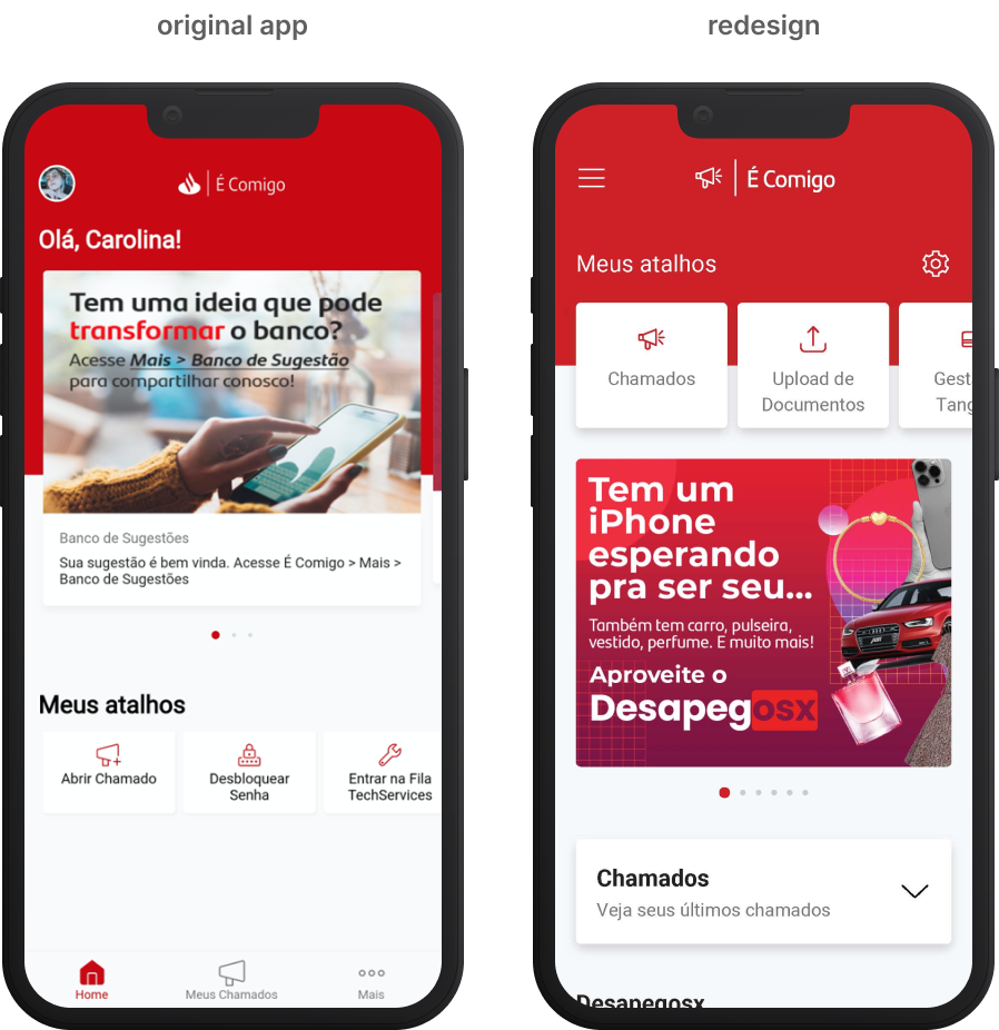
🏠 New Homepage
Previously, the pre-login homepage resembled a news site for bank customers. With the new strategy, the homepage will be redesigned with shortcuts and relevant internal information.
📲 Onboarding on First Access
To prevent confusion among bank customers, the onboarding will clearly communicate the app's purpose.
👥 Profile Segmentation
After identifying very distinct user personas that were previously unmapped, profile segmentation will transform navigation into a tailored experience for each user's daily needs.
🖼️ Heuristic problems resolved
Our biggest and most noticeable UX issues were tied to the basic principles of Nielsen’s heuristics. We had to address problems related to navigation flow, systemic feedback, overall content quality, design patterns and consistency across the platform—plus the bonus challenge of implementing the Santander’s Design System.
Designing for impact
Smart UX decisions lead to impact
⭐ 4.9
final rate
At the beginning of the project, we were dealing with a 3.1 rating or less, depending on the history. And after three months of launch, we reached our highest level.
📝 +4.8k
reviews
Prior to the new version, the App Store had just 96 reviews—we grew that to 2.3k, demonstrating strong user engagement. Google Play reviews increased from 1.2k to 2.5k.

you’ve reachead the end!